Showing posts with label presentation. Show all posts

Monday, December 8, 2014

Font Tips for Presentations


This post was written by Tommy Gugino of Double the Trouble: My Life as a Fraternal Twin. For more shenanigans, visit his blog here.


My name is Tommy Gugino and I am a senior communication major with an emphasis in public relations from Las Vegas, Nevada.


So being a PR major, I look at a lot of advertisements and presentations every week with some of the ugliest fonts I have ever seen. If you know me you know that I am actually quite a font snob especially when it comes to presentations. Nothing bothers me more than a presentation with terrible font choices in them.


Here are six tips to consider when you build your next presentation.


  1. Have a sharp contrast between the font and your background
  2. Don’t use too many fonts in your presentation
  3. Use readable fonts
  4. Don’t capitalize all your letters
  5. AVOID script fonts
  6. Use italics sparingly

Friday, December 5, 2014

Sony's Embarassing PowerPoint according to @Gawker


Oh my goodness. This recently released PowerPoint from Sony is a tragedy, a trainwreck, and a perfect example of what NOT to do. Sony, please hire me and let me fix your mistakes.

Talk about too much text, inconsistency, and what the font choices?!


Check out this mess out for yourself.
 
Sony's Embarrassing PowerPoint


Tuesday, December 2, 2014

How to Create Presentations that Don't Suck according to @Lifehacker

Here's a super useful article on Lifehacker.com written by Melanie Pinola about creating presentations that don't suck. I strongly agree on with problem 1. Too many ideas can really clutter your slide and your audience. Read through the article here

Friday, November 14, 2014

Nancy Duarte's Ted Talk


I wholeheartedly could not even begin to explain the phenomena that Nancy Duarte so simply shares in this wonderful Ted Talk. Please take a few minutes to watch this Ted Talk by Nancy Duarte about why some presentations work and some do not. You will have a greater understanding of why some ideas win over others and what makes a fantastic presentation. This speech truly inspires me to change the world with my ideas and I hope it does the same for you.

If it does, I highly recommend reading Resonate by Nancy Duarte!


Tuesday, November 4, 2014

Better Business Presentations, according to @Inc

Here is a great article about business presentations. I especially appreciate number three because of how important it is to know your audience. You've got to really know who your audience is for your message to really reach them.

Read this article for eight useful tips on building better business presentations!

Building Better Business Presentations

Friday, October 3, 2014

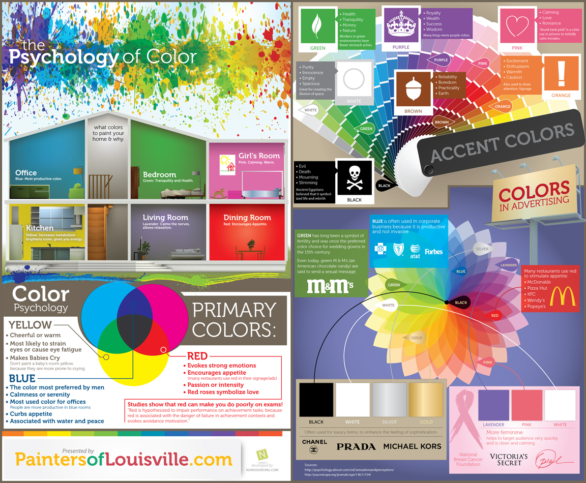
The Psychology of Colors

Here's an amazing infographic (too tiny? do click!) that describes the different meanings of colors in different settings.


Thank you Painters of Louisville for this awesome infographic!

The bottom left and top right of this infographic will be the most helpful for you concerning presentations. 

Think of your idea and the colors that are associated with it. For example, the history of royalty would couple well with purple. Maybe you're talking about finances; green would be complementary. Be cautious of yellow since it most likely strains eyes or causes eye fatigue. Red may make your audience more hungry than attentive to your message. In that case, use blue to curb that appetite and provide a calmer ambiance. Orange will raise that awareness, possibly resulting in excitement or caution. Carefully plan out how colors can help you and your presentation!

Tuesday, September 30, 2014

Using Colors in Presentations


Have you ever sat in a presentation where the background was plain white? How boring was it? Maybe you sat in a presentation where the colors were awfully random and all over the place proving to be quite the distraction. Does that sound all too familiar? Honestly, do tell because I know I've been stuck in that boat numerous times.

For those of you who breeze by with that plain old white background, get some excitement in there, show some spunk! As for those of you who are way too sporadic with the colors, pause and pick a color scheme that fits your message. Just remember, colors evoke emotions.


Maybe you're thinking "Why does it matter what colors I use in my presentations?"


A good question, my friends. I have asked the same question myself. I found my answer when I gave an informative speech on color psychology. Using the right colors can help to add or subtract from your presentation. Let's talk about the meaning of colors.


Red - love, passion, romance, daring, expressive, competitive, and aggressive. 


Yellow - joy, happiness, cheery and energetic.


Blue - stability, reliability, trust, and confidence


Orange - harvest, cleanliness


Green - nature, health, and freshness


Black - formal, elegance, rich, power, but can be associated with death and evil


White - purity, cleanliness, innocence


Brown - dependability, durability


It's good to think about these things because you are essentially selling what you are presenting. What do you want your audience to really see and hear? If you're going to talk about trust and dependability, would you want to have a bold red background or a dreary black background? Blue would probably be the better option. Distinguish what colors fit your idea best. For example, brown can mean dependability and durability. UPS has used that in their logo to invoke those emotions in their consumers. You will want to have the color of your background really accent your idea or story or whatever it is you are presenting. 


Remember, colors evoke emotions.