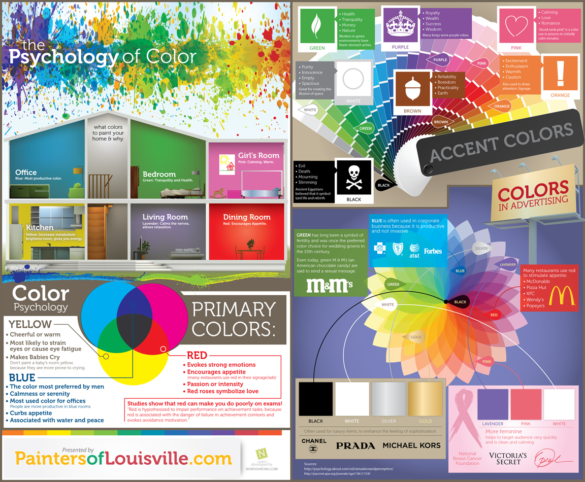
Here's an amazing infographic (too tiny? do click!) that describes the different meanings of colors in different settings.
Thank you Painters of Louisville for this awesome infographic!
The bottom left and top right of this infographic will be the most helpful for you concerning presentations.
Think of your idea and the colors that are associated with it. For example, the history of royalty would couple well with purple. Maybe you're talking about finances; green would be complementary. Be cautious of yellow since it most likely strains eyes or causes eye fatigue. Red may make your audience more hungry than attentive to your message. In that case, use blue to curb that appetite and provide a calmer ambiance. Orange will raise that awareness, possibly resulting in excitement or caution. Carefully plan out how colors can help you and your presentation!
Great article for both high school and college students! No matter which discipline one decides to pursue, everyone should learn the skills to effectively communicate through presentations!
ReplyDelete